|
The first idea you get in your mind when you hear the
word “library” is a dusty boring place. The one in Almere, Netherlands
definitely is not matching the stereotype; its bright design and
creative presentation will not let you stay indifferent.
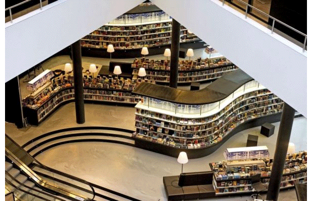
This unusual place was, designed by Dutch design company Concrete
Architectural Associates, has an overall area of 11,000 m2 with 5000
linear meters of bookshelves built with 1 straight and 5 curved modules;
with extended facilities,working places, seating areas, info terminal,
counters, couch lounges with lighting.
|
|
 |
|
Designers aimed to avoid any average look of a library as the philosophy
of the place is to treat customers as shoppers so the bookshelves are
arranged by different shops not alphabetical order.
|
|
 |
|
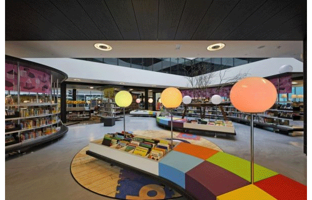
All books are divided according to the named zone like “High Tension”
zone, “Retreat” zone and more than dozens of others covering youth,
culture, health, travel many other topics. This easily satisfies the
needs of the running-by shopper and the one who came to enjoy the
special atmosphere of a library.
|
|
 |
|
The books are showcased frontally with very easy access to them, which
is making the search for your book much more exciting. |
|

|
|
It’s hard to say if the creativity of Almere library ruins its classic
meaning but it surely gives it a modern twist while inviting people to
read in a nice social ambience.
|